Page 1 of 1
Issue with displaying negative scalars
Posted: Tue May 03, 2011 6:08 am
by Dimitri
Hi all,
there's an issue when trying to display scalar values which are negative. Say you want to display Leica laser intensity which for a stupid reason is exported between -2048 and +2048 : the 1st slider controlling the minimum boundary for points to be colored is correctly giving the minimum (-1700 in this particular case) and can be moved, but the 2nd slider controlling the second boundary is set to 0 and cannot be set to a negative value, which means that all negatives values are displayed in blue (if you use the blue/red colorspace). The 3rd and 4th are working indicating both +2048, but the 3rd one cannot be set to negative value while the 4th can be.
Cheers
Dimitri
Re: Issue with displaying negative scalars
Posted: Tue May 03, 2011 7:37 am
by daniel
Hi Dimitri,
in fact the 2nd and 3rd sliders (saturation) are absolute values because they are symmetrical. Normally, if you set min saturation to e.g. 200 and max saturation to 500, the colors should be constant between [-2048;-500[ (blue), ]-200;200[ (green) and ]500;2048] (red). And inbetween it should be linear ramps: from blue to green in [-500;-200] and green to red in [200;500].
At least this is the standard behavior. I'll check this asap.
Daniel
Re: Issue with displaying negative scalars
Posted: Mon Jun 20, 2011 4:48 am
by Dimitri
Hi Daniel,
sorry I didn't see your reply. The problem is that the laser reflected intensity for Leica scanners is almost all the time negative...hence if I wanted to have a linear color ramp between -1200 and -800, I don't think it's possible at present. And to be frank this is quite unintuitive to have the 2nd and 3rd sliders that cannot be negative while the 1st and 4th can. But that's not urgent !
Cheers
Dimitri
Re: Issue with displaying negative scalars
Posted: Tue Aug 09, 2011 1:15 am
by Dimitri
Hi Daniel,
I'm back on this issue as we are currently developing a signed difference software and we need to visualize negative and positive scalars.
The problem is when you want to display scalars that are mostly negative, you cannot use the entire color scheme. In the best case, you're limited to half of it (typically blue-green rather than blue-red).
I suggest that the saturation slides operate irrespective of the sign of the scalar. If the scalar goes from -10 to +5, the following combination should be possible (combinaison of the four slides)
-10,-10,5,5 : gives a full mapping of the scalar from blue to red -> does not work at the moment
-10,-10,0,0 : only map the negative part from blue to red for -10 to 0, with all positive points in grey -> does not work at the moment
0,0,5,5 : only map the positive part, with all negative in grey -> currently working
Also, it might be interesting to design a new color scheme specifically for scalars that are negative and positive to better highlights zone of positive or negative difference. An interesting one is going from red to white in the negative part, and from white to blue on the positive part. For the previous example, -10,-10,10,5 would generate a map in which null scalar will not be colored (white).
Finally, just a note : on the recent "optimus" type laptops that combine a discrete GPU and a CPU-integrated one which can activate automatically depending on battery and/or required graphic power, qcc is run by default on the CPU-integrated GPU (with rendering issues such as text disapearing etc...). You need to manually force the discrete GPU to be used when opening qCC (and on my nvidia GPU there's no rendering issues).*
Dimitri
Re: Issue with displaying negative scalars
Posted: Sat Aug 13, 2011 2:21 pm
by daniel
Hello Dimitri,
It's true that the sliders are a bit limited while already quite complicated...
With the system you propose, how do you handle saturation near 0 ? For example to have a constant color between -2 and 2 and regular color ramps between -10:-2 and 2:5 ?
But I get your point and I'll try to upgrade this soon. And no problem to add new color ramps (it's much simpler!).
Daniel
P.S. : I've got a similar laptop (Vaio Z) with 2 graphic cards, I'll try to check this issue (but I never noticed such behavior).
Re: Issue with displaying negative scalars
Posted: Tue Aug 23, 2011 4:59 am
by Dimitri
Hi Daniel,
ok, now I understand better how it works, and with the solution I suggest there's no way to change the saturation near 0 (this would require a 5th central slider for the specific case of negative values, and it would be quite cumbersome).
Indeed there's no simple solution with only 2 sliders to accomodate for the various configurations. At present it works well with relatively symmetrical scalar values, and it should be kept like this. But it does not really work with negative scalars. Maybe you could introduce some kind of toggle mode (like the "Positive" only button) in which the sliders operates in the mode I suggest ?
May I also just suggest a few changes to the color scale for presentation purposes. Let's suppose the scalar range from [-3 and 6]:
If we set the sliders to their default configuration
. At present : the color scale is always symmetrical meaning that you get several grey squares in the negative part to fill in between -3 and -6. It'll be great if the scale could always start from the true minimum (i.e. -3 in this case, even if there's less cases in the negative part than in the positive) and go up to the true max
Now, suppose the sliders are set as -3,0,2,6
. At present, the minimum negative value indicated is -6 (forced symmetry), while it is indeed -3. Could this be changed ?
Other cosmetic aspects :
. Would it be possible to give names to the scalar fields that would then be displayed on top of the scale ?
Finally :
. Could there be an option to render systematically the horizontal spatial scale during file export ?
Cheers
Dimitri
Re: Issue with displaying negative scalars
Posted: Mon Aug 29, 2011 9:41 am
by daniel
Hello Dimitri,
here is a first peak on the new 'color scale' system.
- I've found very neat widgets to handle intervales (Qxt library 'SpanSlider' - libqxt.org). It should help to better understand how the sliders work.
- I've added options in the 'Display settings' dialog to handle the color scale display and behavior (squares size, text size, 'always display 0', and 'always symmetrical' - this last one is forced for the moment as I didn't had the time to change this last point - the new release will come out as soon as this is ready)
- there's a new color ramp named 'Blue>White>Red' as you suggested (I juste kept the convention: blue for minus (cold) values and red for positive (hot) values)
- as the color scale is not always linear, I've added a new type of square (a slashed one) to indicate the ones that have not the same span as the others
In this new version of CloudCompare you'll also be able to rename de scalar field. I'll try also to make CC rembember the SF name when the cloud is saved as a 'bin' file.
EDIT 09-04-2011: the last version is out. You'll find everything you need in it!
Re: Issue with displaying negative scalars
Posted: Mon Sep 05, 2011 12:55 am
by Dimitri
Hi Daniel,
excellent. Thanks for the great update.
Minor issues :
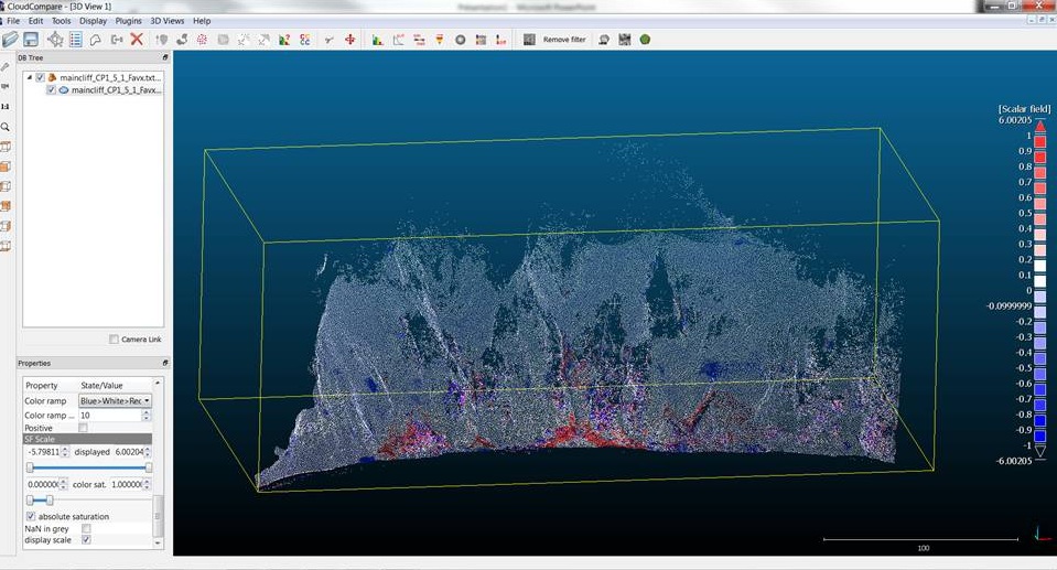
. There seems to be an issue with the symmetry of the color scale when the absolute saturation is on (visible for the blue-white-red color ramp). Here you can note that the white scalars correpond to 0/0.1 and 0.1/0.2 while it should be -0.1/0 and 0/0.1. Also there's sometimes rounding issues (not all the times !).

- Issue_CC1.jpg (156.35 KiB) Viewed 37088 times
This symmetry issue is still there even if the color saturation starts above 0.
Finally, it's not that important, but when the absolute saturation is on, the minimum and maximum in the scale are identical. Any chance the minimum and maximum could actually be the true one (for the example above -5.798 rather than -6.00025) ?
Re: Issue with displaying negative scalars
Posted: Mon Sep 05, 2011 12:00 pm
by daniel
Hum,
didn't you want to work in non-absolute mode? In this mode, the minimum and maximum are actually the true values.
For the other issues, the color in each square is generally the color that you would get with the average value in this square. But for some specific values (0, min and max, etc.), the square has the corresponding color. It might explain this behavior. I'll look into it to sort this out.
Daniel
Re: Issue with displaying negative scalars
Posted: Tue Sep 06, 2011 2:50 am
by Dimitri
Hi Daniel,
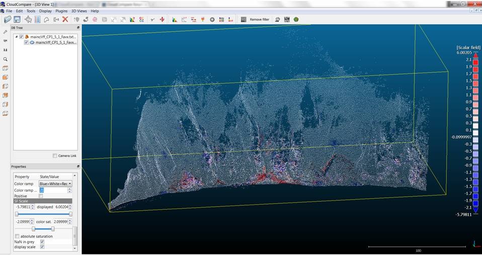
true : in non absolute mode, you have the correct min and max, and I can manage to have the white centered around 0 (but you have to play with the number of intervals and choosing well the min and max color saturation), but I still have some rounding errors :

- Issue_CC2.jpg (140.51 KiB) Viewed 37083 times